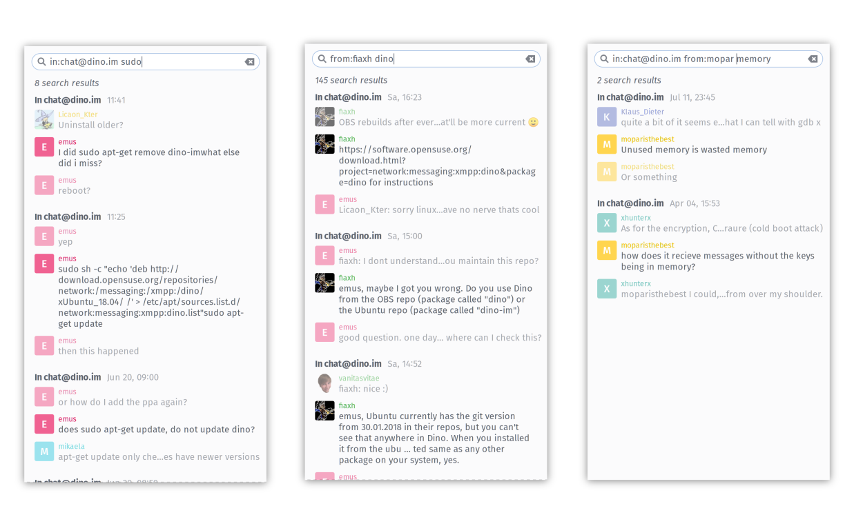
Prototype filters
One of the cool features of modern search engines - both in web search and chat search - is the ability to further filter the results using special expressions. Inspired by the same functionality in Slack, I prototyped a first set of three filters:
from: Only show messages sent by a specific user - in a channel or private chatin: Only show messages send to a specific channel, by any user of that channelwith: Only show messages that appeared in a private chat
More to be added
Obviously there is a lot of potential for more filters to be added:
before: Given a date, show messages sent before that dateafter: Given a date, show messages sent after that dateon: Given a date, show messages sent on that date.
Dates may either be given by day (optional for before and after, defaulting to first or last day of month, respectively), month and year (optional, defaulting to the last occurrence of that date) or using a relative statement like today or yesterday
during: Given a time-span, show messages sent during this time-span (inclusive)
There are different ways to specify a time-span: using two dates (as defined above), a month or year description or again using relative statements like last week.
has: Check if the message contains something in the body to fulfill a criteria. Candidates here arelinkandmention, but as time passes, there might be other things to do here.
Auto-completion and user interface improvements
These cool filters would be really useless, if they are hard to use. Nobody wants to type the full ID of another user, especially for whispered messages in channel, they can become annoying long and complex. Best way to solve this is to provide a user friendly auto-completion, not only in its verbatim meaning: being able to use a contact’s name instead of the ID drastically eases the use of this feature. I also imagine the auto-completion hints to show the contact’s picture, to make things even more convenient. But even after we had the auto-completion done, it would be great to have the filter visible in a more user-friendly way. There is no reason that I can type in the middle of a filter statement - it will usually just make it invalid. Displaying the filter more like a tag (that can only be removed as whole) makes way more sense - and also allows for more flexible ways to display those - again imagine to somehow show the contact’s picture next to that tag.
Details pending
We - me and my mentors - are still not sure how exactly we’d like all these filters and user interface to be, just that it is definitely needed. I’ll explore different ways to do all this, but this might not be completed before the end of the Google Summer of Code (August 6) - especially as I am still working on fixing some bugs and cleaning up the code. Let’s see how far we get within this time.