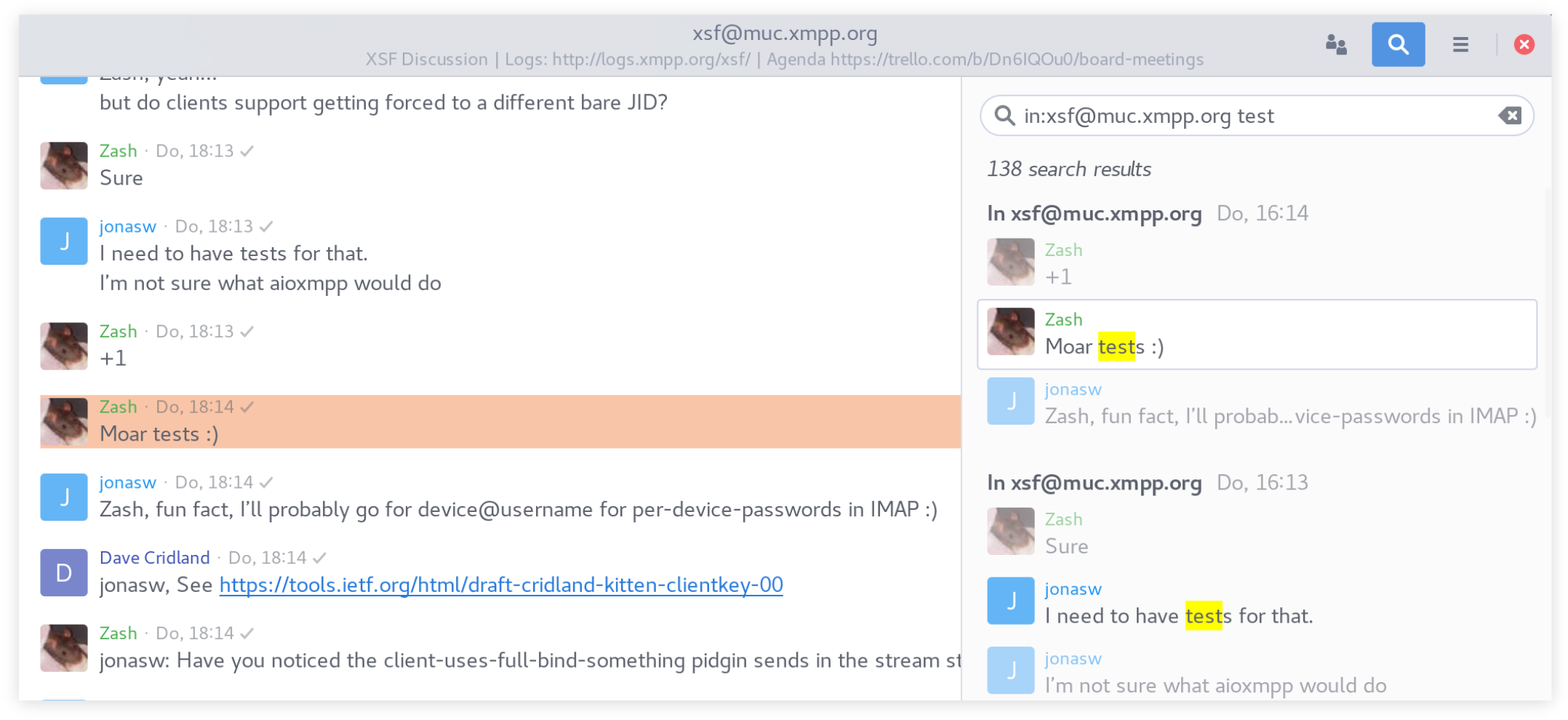
Jumping to results
For each search hit in the results, three messages are (partially) displayed: The actual hit and the messages before and after that. The hit is clickable and clicking it will jump to the hit in the conversation history. The clicked message is highlighted with a CSS animation by fading a background color in and out.

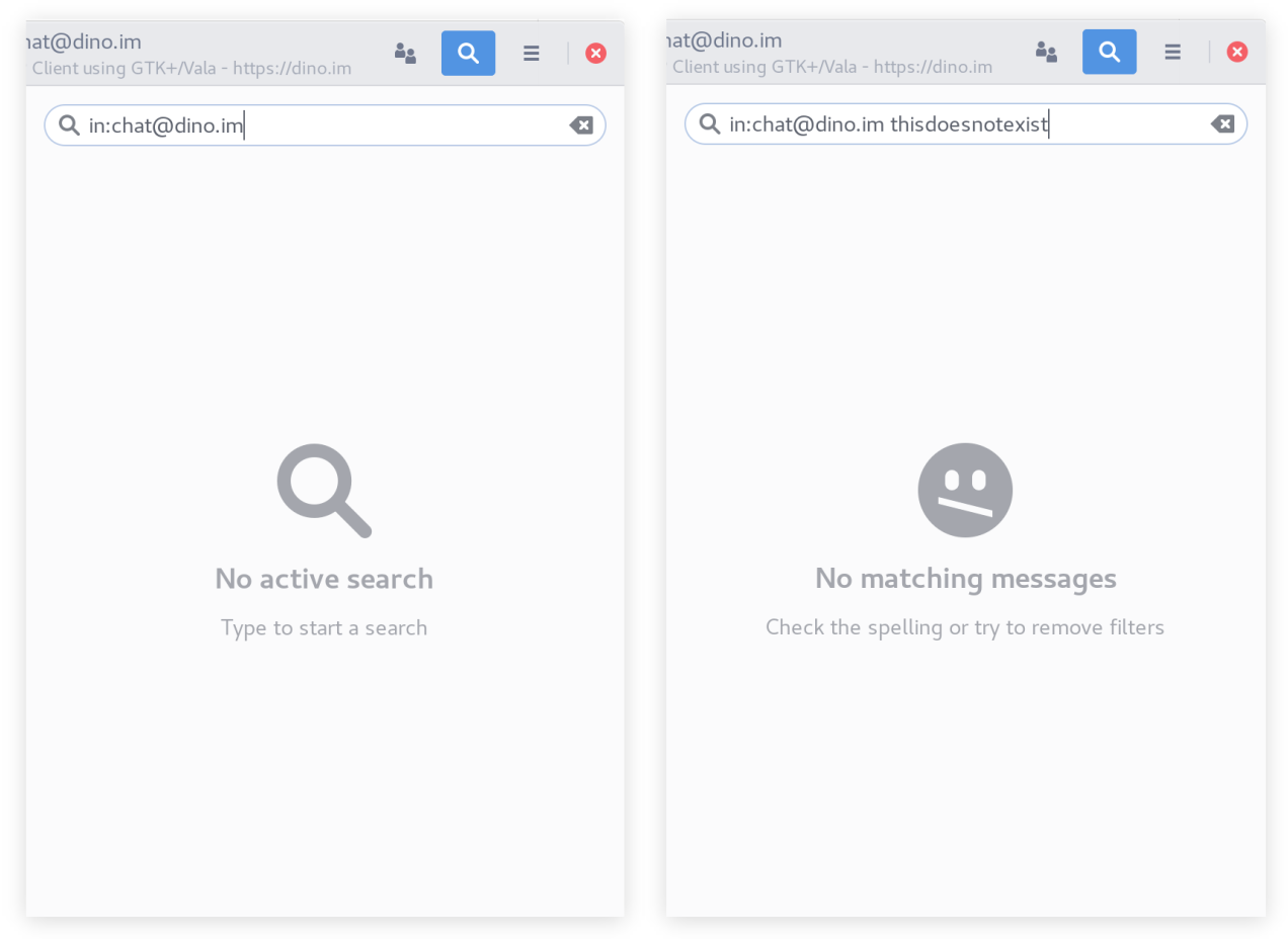
Empty placeholders
I added placeholders to clarify the states where no results are shown because nothing was searched yet and where no results are shown because there where no matching results. Following the GNOME HIG, the placeholders contain an icon, a state description and suggestions on how to proceed.

Minor change of plans
In my UI mockups I planed to collapse the search sidebar into only displaying the search entry after a hit was clicked. This was supposed to let the user know that a search is still active and that he/she can resume the search without requiring much screen space. However, this introduced more states to the search feature and thus leaves more room for confusion. Also, reopening the search from the collapsed state would need a click/shortcut, while just completely reopening the search would require the same amount of interaction. Thus, the collapsed state does not save the user interaction steps and might be harder to understand. Instead, the search text is simply not removed from the search entry when clicking on a result. When the user desires to resume the search to explore other results, he/she can open the search again and will find the old search results. The text is marked, thus simply typing over it is possible. The search text is still reset when changing conversations.
Bug hunting
I had to hunt down and fix some displaying issues in the history search and other bugs I introduced while refactoring parts of the conversation view structure.
During the final days
I have been working on user name auto-completion and nice displaying of filters. There is some final work and testing to be done on them and then I can open a PR!